Individual solution for a new barbershop brand Mr.Shakh
Date:
May-June 2019
Type of work:
Turnkey landing page development - UX/UI design, layout and programming.
Not everything is as simple as it seems...
The standard approach of barbershop website developers and the main “pain” of the target audience is to make a heavy site: “there must be animation, the video should run on a background, etc.” And customers remain dissatisfied with the loading speed, because they just need to “order quickly.”
To successfully compete in the premium segment, a new website must be distinguished by its minimalist information, which will allow it to be fast, especially from mobile devices, as the main thing for conversion. This will turn the disadvantages of a young brand into its advantages.
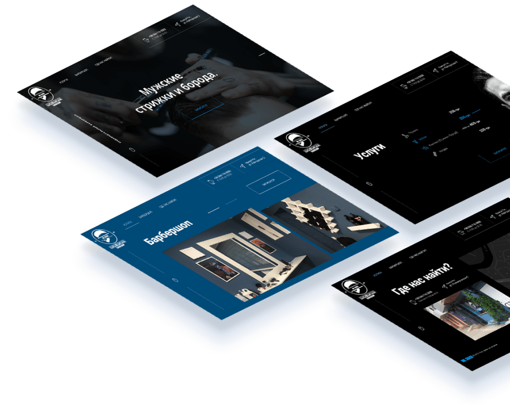
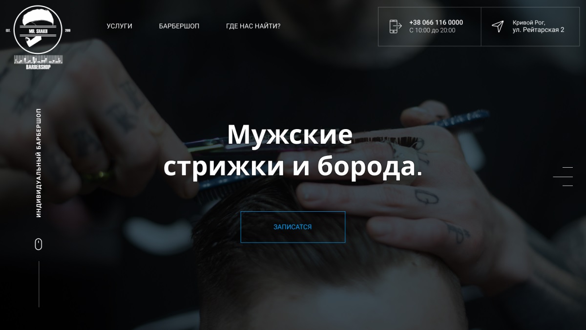
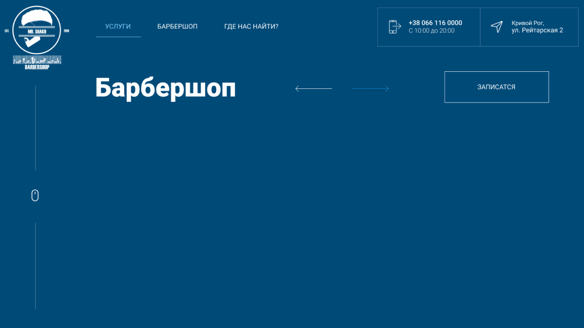
Main screen
An image photo and the most simple and understandable description allow the user to immediately understand where he is.
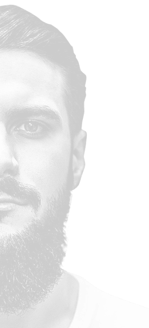
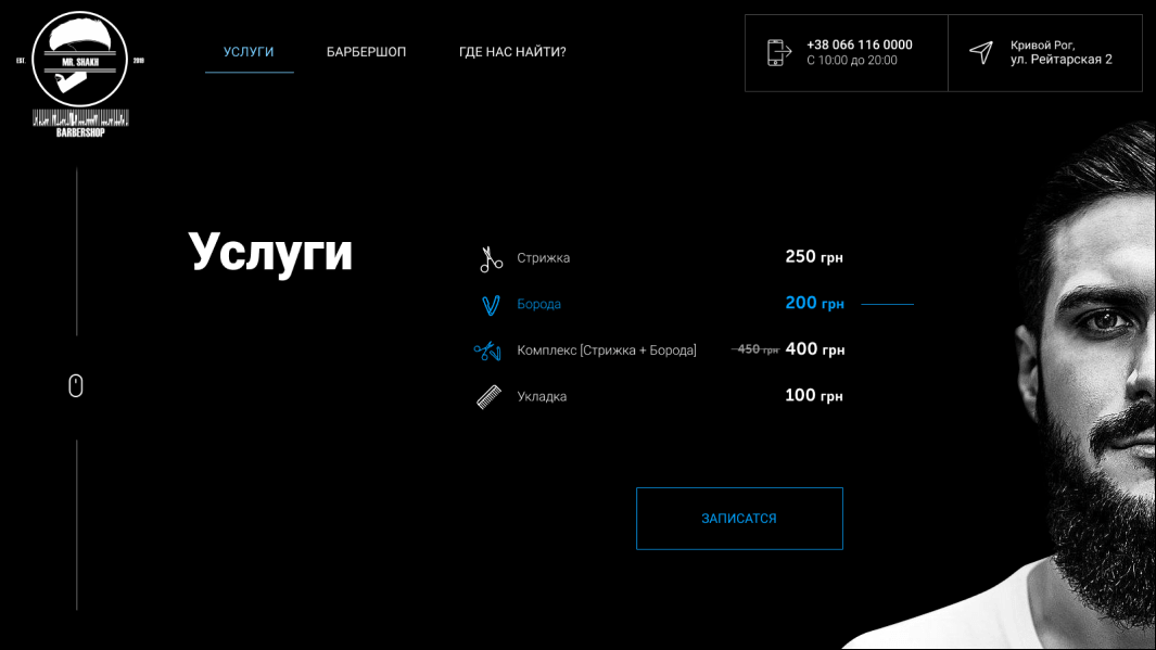
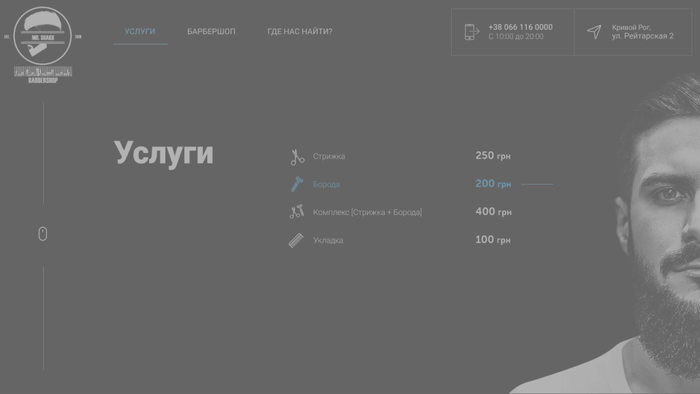
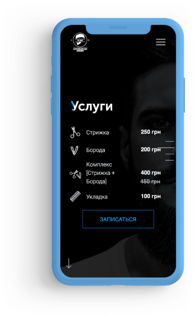
Services
Nothing superfluous, just minimalistic design, professional photos and stylish icons. We focused on the textured photo of the master so that the user immediately understands that this is a personal brand.
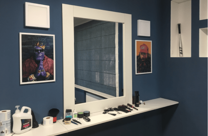
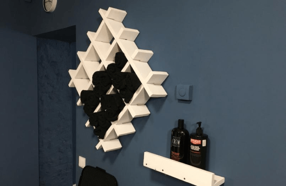
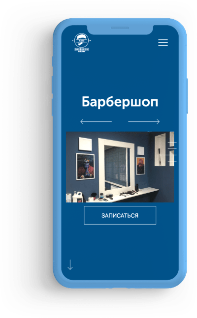
Barbershop
Live photos of the salon and an original slider to show the spacious salon and the client’s individual space, which is important for the target audience.


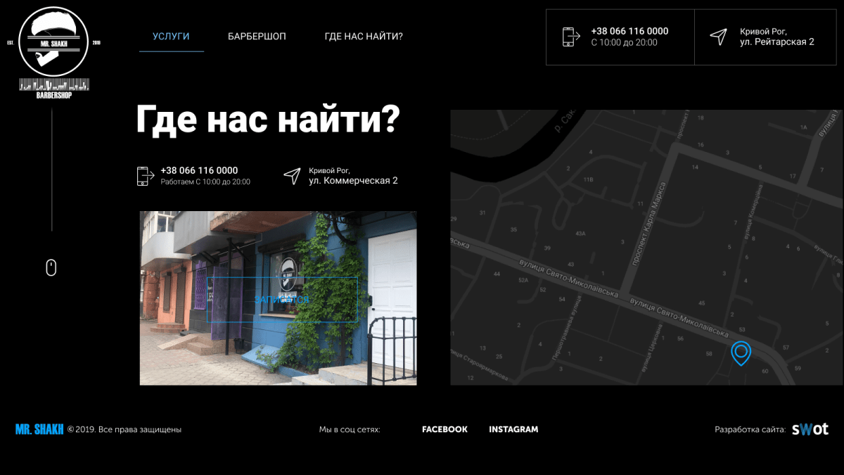
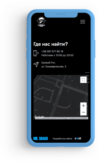
Contacts
Photos of the facade, contact information and convenient display on an interactive Google map make it easy to understand how to get there.


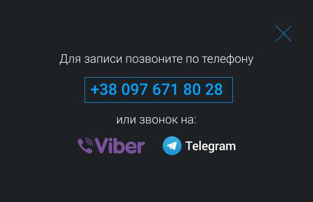
Simple order
To receive an application by phone, we implemented a custom order form to work with a direct call in the mobile version and the ability to call messengers from a PC.
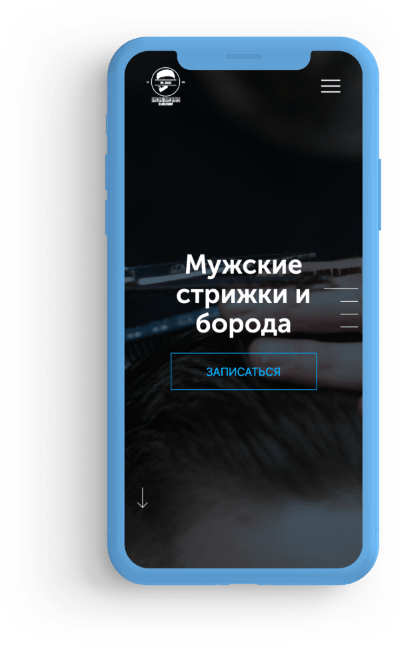
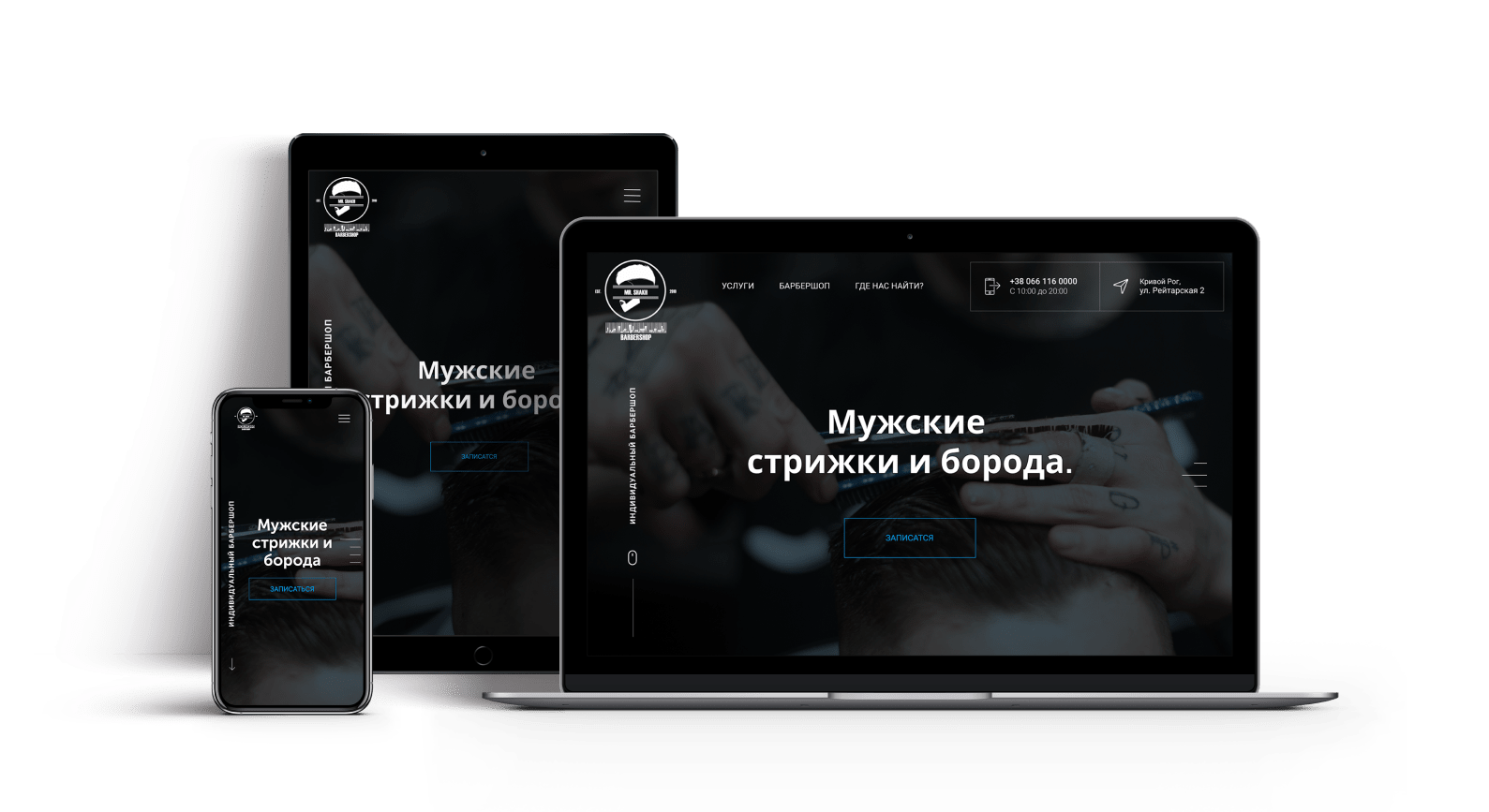
Mobility
Particular attention was paid to the usability of the mobile version, because most customers order from smartphones. We have optimized the site and developed adaptability for all popular smartphone resolutions (especially iPhone), which ensures maximum ease of interaction and conversion.


The result is a break in patterns.
The site differs in many ways from its competitors in its original concept - a departure from the generally accepted approach - the rejection of a banal portfolio with photos of clients' haircuts, its brevity, fullscreen presentation format and emphasis on the simplicity and speed of ordering from mobile phones.
The best assessment is feedback from representatives of the target audience, which can be boiled down to a simple thought: “It’s especially cool that it loads normally from a mobile phone, because hair salons usually have a mania for making a heavy website.”

Armen Shakh
Manager and creator of "MR.SHAKH Barbershop"